OPEN Healthcare is a company that creates a healthy future for humanity.

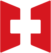
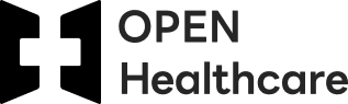
Symbol
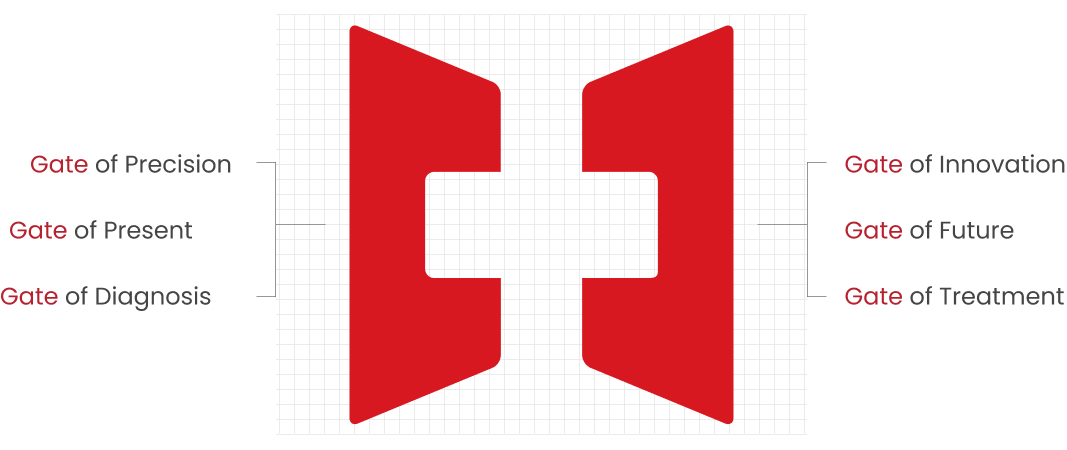
- It symbolizes opening a new door to a global healthcare and
diagnostic platform. - It signifies that healthcare is open and accessible to all.
- The combination of Precision and Innovation symbolizes
a global company providing top-notch healthcare services.
Logo Type
The logo type, along with the symbol mark, is the most fundamental element for visually conveying OPEN Healthcare’s image. When using the signature, it cannot be presented in languages other than Korean and English, and the use of logo types in combinations of uppercase letters is prohibited.
– Basic Type

– Applied Type (Vertical Combination)
– Applied Type (Horizontal Combination)
Color System
The color scheme is a fundamental element that shapes OPEN Healthcare’s distinctive color image, serving the function of conveying OPEN Healthcare’s image through the application to symbol marks, logo types, and various visual media.
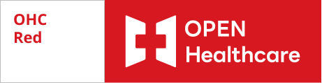
Printing
Pantone 1795 U
Process Color(CMYK) 0,100,100,10
Media
RGB R204,G0,B0
WEB #CC0000
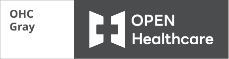
Printing
Pantone Cool Gray 10C
Process Color(CMYK) 0,0,0,85
Media
RGB R99,G102,B111
WEB #63666F
B/W Color – K:100%
Black-only is used only for 1-color printing on black and white media or promotional materials.

Gold Color
It is used only after gold foil finishing.
(Silver foil is recommended first, and the use is very exceptional for promotional material production.)

Silver Color
It is used only after silver foil finishing.
(It is recommended first for promotional materials or printing.)